
Brand & Web Design
Why Handcrafted Design Is Standing Out Right Now

Justin Wagoner
Creative Director
Justin Wagoner leads DesignSilk and has over 15 years of experience, most of it spent leading design at healthcare companies.

I’ve been noticing more design that feels deliberately made by hand. Handwritten lettering, loose illustrations, textured characters, and little imperfections that give the work personality.
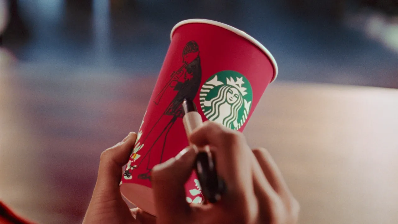
Starbucks’ new holiday campaign brought that feeling into focus for me. Its characters look like someone sat down with a pen and started drawing, which is essentially how the artwork began.
What interests me is the timing. As AI makes creative work faster to produce, I think we’re going to see more brands choosing a visual language that suggests time, care, and a person behind the work.
Four other campaigns introduced between October 27 and November 2 make this worth watching. Alongside Starbucks, they show several different ways to make human craft part of a brand’s story.
Starbucks starts with a Sharpie and a cup
For “Perfect Harmony,” Starbucks worked with Anomaly and artist Geoff McFetridge, who drew the artwork by hand using Sharpies on Starbucks cups. The characters become a small band of musicians, separated and eventually reunited in the holiday film. The campaign was covered on November 4. See the campaign and production details.
I like how naturally the technique belongs to Starbucks. A marker on a paper cup is already part of the brand’s visual language. Turning that familiar gesture into a commercial gives the handmade style a reason to be there.
It also makes the work easy to imagine making. You can picture the pen, the cup, and the person drawing. I think that connection is part of its appeal.
Prada makes the drawing process part of the attraction
Prada’s “Drawing Prada: Animated by Hand” was introduced on October 27. Its holiday films combine live-action photography by Glen Luchford with illustrated winter worlds created by artists led by animation director John Pomeroy. Explore Prada’s campaign. Read the October 27 launch coverage.
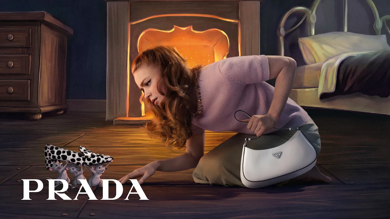
Even the name asks us to notice how the work was made.
For a luxury brand, that feels like a meaningful choice. Craft is part of what the product is asking people to value, so giving the campaign an identifiable drawing process helps express that idea.
The combination of photography and illustration matters, too. Handcrafted design can sit comfortably alongside other techniques. It can shape the feeling of a campaign without having to account for every part of its production.
Levi’s gives knitwear a world you can almost touch
Launched globally on November 2, Levi’s “Let’s Get Fuzzy” introduces a yeti named Gus through stop-motion animation. Levi’s says its sets and characters were made by hand, with miniature outfits reproduced by artisans. The company reports that each second of animation required four hours of filming. See Levi’s campaign and film.
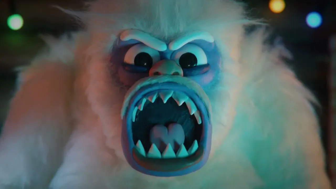
The connection between the medium and the product is especially clear here. A campaign built around sweaters benefits from a world that feels physical, soft, and textured.
That’s a useful creative decision. The technique helps communicate something about the clothing before anyone explains the collection.
It’s also a reminder that an older production method can support a completely new campaign. The familiarity of the medium becomes part of the experience.
e.l.f. uses handmade characters to tell a story about individuality
“e.l.f. Made to Stand Out” debuted on November 2. Directed by Cami Kwan of Apartment D Films and narrated by Alan Cumming, the film follows three friends returning home for the holidays. e.l.f. describes the production as handmade stop-motion, with individually molded characters and miniature sets. Explore the campaign and production story.
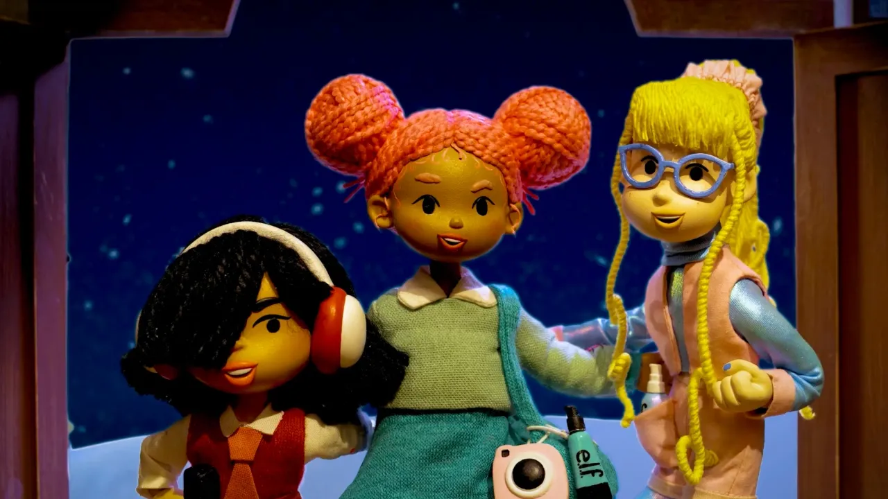
The brand connects that approach to its message about individuality. Characters made separately, with their own details and personalities, are a fitting way to tell a story about people embracing their differences.
That gives the aesthetic a purpose beyond nostalgia. The handmade world supports the idea the brand wants to communicate.
For me, that’s where this approach becomes interesting as design: the way something is made can help tell the story.
Thatchers combines physical craft with digital production
Thatchers’ “Saving Tasting Time” launched on November 2, created with Aardman and Bray Leino. Its miniature version of Myrtle Farm includes handmade sets and costumes. Aardman says Martin Thatcher’s tiny coat alone took a week to make. Read the brand’s launch announcement and watch the film.

There’s an important detail in Aardman’s production account: the film combines stop-motion animation and puppetry with CGI. Aardman’s production details.
That combination fits the broader point. A campaign can feel handcrafted while using digital techniques to bring everything together. CGI is computer-generated imagery, and its presence alone tells us nothing about whether generative AI was used.
The human feeling comes through the objects, characters, and creative choices.
The anti-trend becomes a design direction
These are all holiday campaigns, when warmth, nostalgia, and togetherness are natural creative territory. Five examples don’t tell us where the entire design industry is heading, or establish that every brand chose its approach in response to AI.
Still, I think the timing makes them worth paying attention to.
Design trends often give us something to react against. When a particular look becomes common, its opposite can start to feel refreshing. That’s the anti-trend phenomenon I see taking shape here.
With the uncertainty around AI and creative work, I can understand the appeal of visuals that seem to carry evidence of someone’s hand. An uneven line, a sculpted character, or a carefully made miniature can suggest patience and attention.
My prediction is that more brands will lean into those qualities as a kind of human stamp of approval. The process itself may become something they want audiences to notice.
Looking handmade doesn’t prove how something was made
There’s a wrinkle in that prediction.
Even if a character with a hand-drawn look was created using generative AI, choosing that style can still feel like a very human creative decision. The human touch can come from the direction as much as the technique.
That leaves us with two things worth considering: how a campaign was produced, and how its visual language makes us feel.
When a brand tells us artists drew, sculpted, stitched, or animated the work, that process becomes part of the story. When we’re responding only to its appearance, the impression of craft can be powerful without proving anything about the tools.
I think that tension will become more interesting as this style spreads. The look may suggest a person behind the work, while the production story gives us something more concrete to understand.
For brands considering this direction, I’d start with what the style helps communicate. Starbucks has the familiar gesture of drawing on a cup. Levi’s has the texture of knitwear. e.l.f. has a story about individuality.
Those connections give the creative choices meaning.
I expect we’ll see more handwritten, hand-drawn, and tactile design. What I’m curious about is whether audiences will respond to the appearance of human craft, the knowledge that people made it by hand, or some combination of both.
Would knowing how a campaign was made change how you feel about it?

No headings found on page