Case study
Milrea
Brand identity · Marketing design · Website
Bringing complex
ideas into focus.
Milrea turns the knowledge inside an organization into workflows it can own and operate. DesignSilk built its brand from the ground up around a prism: light refracting into distinct rays, making visible what was already there. The logo connects Milrea’s “Refining Light” philosophy to a visual identity built on clarity and structure.


Light, given structure
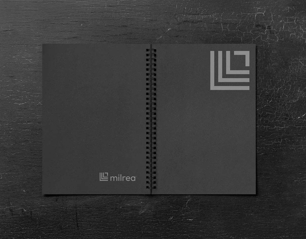
The mark translates rays refracting through a prism into a set of ordered, angular paths. That geometry carries into the icon system, giving the brand a consistent language for explaining complex ideas. Poppins keeps the typography approachable, while black, white, and cool gray establish a disciplined foundation. Electric cyan adds emphasis and connects the system to the imagery of light.




A system built to travel
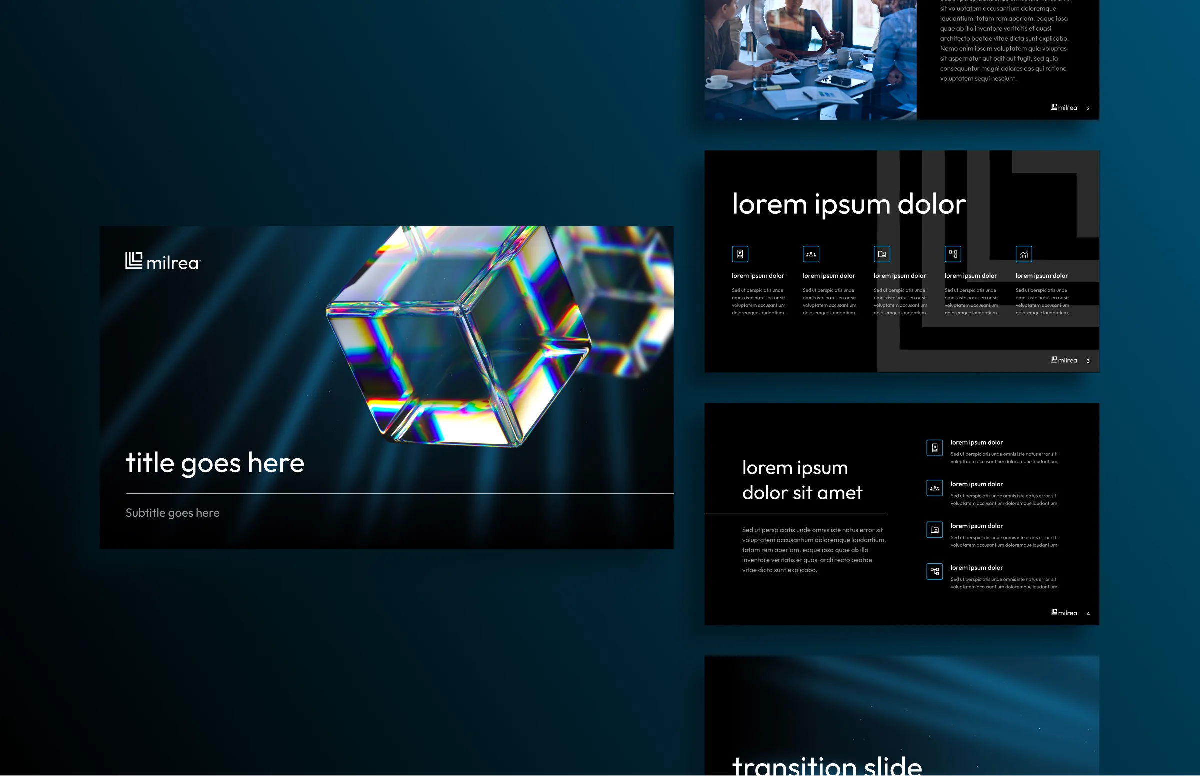
Prismatic imagery and beams of light give presentations and social content a recognizable visual signature. The deck and LinkedIn templates carry the same typography, contrast, and graphic language into everyday communication. On business cards, notebooks, and drinkware, the simplified mark stands on its own, showing how the identity works beyond the screen.

Making the offer clear
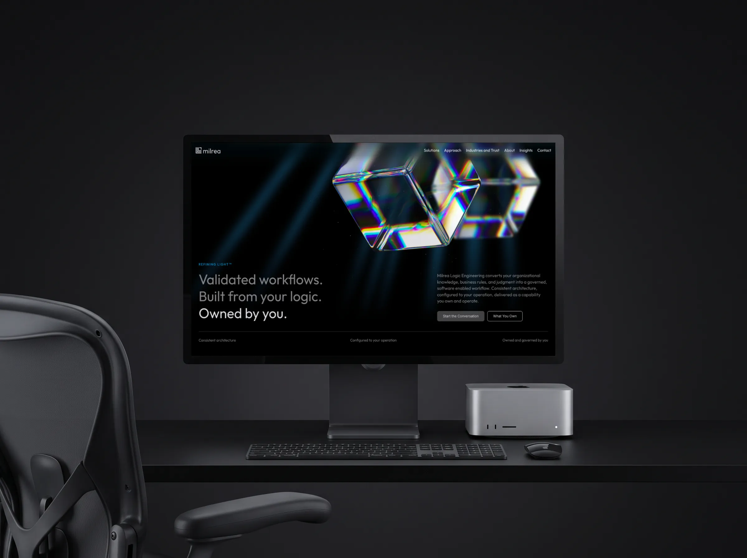
The website gives Milrea’s technical offering a clear reading order. Strong headings, focused content blocks, and diagrams break the story into understandable parts: what the company builds, how it works, and what the customer owns. A dark canvas and luminous prism imagery create the first impression; restrained cyan accents and generous spacing keep the detailed pages readable.